SafeBikely - 12x user growth through a ground-up redesign
SafeBikely - 12x user growth through a ground-up redesign
(Role)
(Role)
UX Designer
UX Designer
(Client)
(Client)
SafeBikely
SafeBikely
(Year)
(Year)
2020
2020

SafeBikely had a real product and a real market — smart bike lockers deployed across Norway, targeting commuters, workplaces, and cities. The app connecting users to those lockers was holding the business back. Low adoption, poor performance, and a UX that had never been properly designed from the ground up. I came in to fix that.
SafeBikely had a real product and a real market — smart bike lockers deployed across Norway, targeting commuters, workplaces, and cities. The app connecting users to those lockers was holding the business back. Low adoption, poor performance, and a UX that had never been properly designed from the ground up. I came in to fix that.


Before
Before

After
After
The Challenge
This wasn't a cosmetic redesign. The existing app had structural problems — unclear navigation, a registration flow that created unnecessary friction, and no coherent information architecture underneath it. The goal was to rebuild the experience around the user's actual job: find a locker, book it, get in, get out.

Process:
The redesign ran through weekly design sprints in a cross-functional team — Product Owner, UX Director, and developers in the loop throughout. I started with market and competitor analysis to understand what was working elsewhere in mobility apps, then rebuilt the information architecture before touching a single screen.
The central design tension was familiarity versus improvement. Users who already had the app had built habits around its quirks. A redesign that moved too fast would alienate them; one that moved too slowly wouldn't solve the underlying problems. Sequencing what to change — and what to leave alone — shaped most of the early decisions.
From there: sketches, team feedback, iteration, and high-fidelity prototypes for both iOS and Android before handoff.

What changed:
The redesign introduced a streamlined booking flow directly from the map, phone-number authentication replacing a friction-heavy registration process, and three new navigation features — parking history, saved locations, and an in-app help section with live chat — each addressing a distinct gap in the original experience.
The redesign introduced a streamlined booking flow directly from the map, phone-number authentication replacing a friction-heavy registration process, and three new navigation features — parking history, saved locations, and an in-app help section with live chat — each addressing a distinct gap in the original experience.
Onboarding
Onboarding
Onboarding
First-time users needed to understand a physical product — bike lockers — through a digital interface. The onboarding flow was designed to close that gap fast, without over-explaining.
First-time users needed to understand a physical product — bike lockers — through a digital interface. The onboarding flow was designed to close that gap fast, without over-explaining.

Registration & Login
Registration & Login
Registration & Login
Replaced a form-heavy registration process with phone number authentication via SMS — fewer fields, less cognitive load, faster path to first use.
Replaced a form-heavy registration process with phone number authentication via SMS — fewer fields, less cognitive load, faster path to first use.

Navigation & Search
Navigation & Search
Navigation & Search
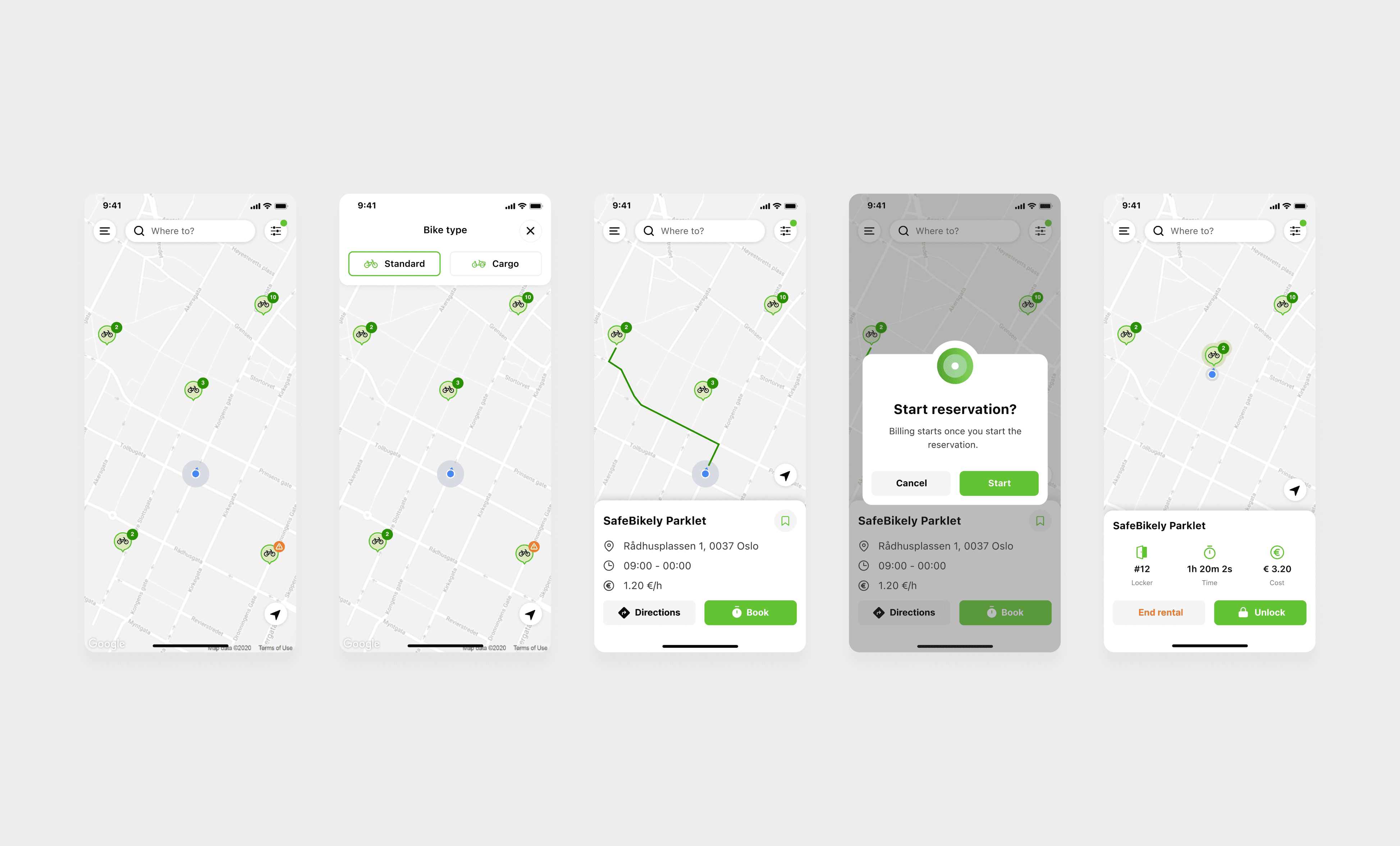
Added three features absent from the original app: parking history for managing past reservations, saved locations for frequent spots, and a help section with live chat for in-locker issues. Search was rebuilt to surface nearby availability without extra steps.
Added three features absent from the original app: parking history for managing past reservations, saved locations for frequent spots, and a help section with live chat for in-locker issues. Search was rebuilt to surface nearby availability without extra steps.

Booking
Booking
Booking
Reduced the reservation flow to the minimum viable number of steps — directly from the map, with real-time visibility into duration and cost before confirming. No surprises at checkout.
Reduced the reservation flow to the minimum viable number of steps — directly from the map, with real-time visibility into duration and cost before confirming. No surprises at checkout.